How to Build a Unique Brand Identity on a Budget
Maybe you’re not ready to invest in a totally custom brand identity yet (but I’m here when you are!). If your budget is more shoestring than Louboutin, and you needed to start off with something DIY, here’s how I would guide you.
And whether you hire someone to create the brand of your dreams or not, this is still solid advice for after you’ve got that magical brand toolkit in hand, and want to know what to do next.
Strategy First
A great brand doesn’t start with design. It starts with strategy and positioning – and the design flows from that.
Before pencil hits paper, or I open up the Adobe Creative Suite, I guide my clients through a live Brand Workshop in which we do a deep dive into their business: core offerings, target audience, values, personality, competition, and most importantly – what makes them different (and the best option for their customers).
Although I draw out answers from my clients during these workshops, this is something you can sit down and do with an extra 60 minutes. Grab a cup of coffee, find a comfy seat, and jot down the answers to these big existential questions as best you can:
Who is my target audience and what problem do I help them solve?
What other brands does my target audience buy from and why?
What are my biz’s core values?
What makes me a better choice than my competitors?
Figuring out your market niche will help you define your messaging, and the appropriate tone of voice – and these will inform your design decisions.
I won’t lie – this is one of the most difficult parts of branding! If you’re ready for a pro to walk you through these deeper existential questions and help you visually define your brand, let’s chat.

Consistency 👏🏼 Is 👏🏼 Key 👏🏼
Whether you’re DIY-ing your brand, or working with a brand toolkit that someone made for you, there’s one principle that will get you 80% of the way to your goals. Repeat after me: consistency.
Consistency is the discipline of sticking to your defined brand elements in a rigorous fashion. Stick to your font and color palettes (regardless if you see something new and cool you want to incorporate). Keep the headline font, the headline font. Keep your tone of voice positive, and customer-focused. Don’t stretch or add drop shadows to your logo. When you present a unified front to the world, your customers know what to expect from you, which creates trust over the long term.
As your Brand BFF with shiny object syndrome, I get how tempting it is to incorporate the latest cool font or color into your brand. However, deviating from your brand standards causes audience confusion and disrupts your curated aesthetic and tone of voice.

Designing a Logo
A logo could be literal (Apple), or abstract (Nike swoosh). It could include a lovely and simple icon (CBS), handlettered script (Coca-Cola and Disney), or a beautiful heritage mark (Burberry knight).
What’s key is finding that nugget of an idea that makes your biz unique and interesting (even if it’s a little weird). No matter what route you choose, your logo will become infused with meaning over time. Remember, you’re playing the long game.
If you’re DIYing a logo, make sure it’s simple enough to use at very small sizes – most brands live in the digital realm these days, and need to get teeny-tiny on social media and web favicons. This isn’t the place for a detailed illustration – those can be fit in elsewhere. Simplicity is your friend.
(Sidenote – I design an entire toolkit of logos for my clients to deploy for different scenarios – some for use at larger sizes, some for smaller, some for merch, some for socials. This gives ultimate flexibility for any place a brand needs to show up. But when you’re DIY-ing, it’s best to have just a couple marks that can get the job done. )
Scale your logo or icon down to 20px – is it still pretty recognizable? This is a good litmus test. If your logo is just a wordmark, shrink it down very small, too. Can you still reasonably read it?
Other than simplicity, the ideal way to design a logo is black and white first. The mark of a good logo design is that it does not rely on color. Color is an additional emphasis and ‘wow’ factor for the great design that’s already there. Plus, you want to make sure your logo can be screenprinted on merch, where budgets are often limited and a white or black-only tee design is ideal.

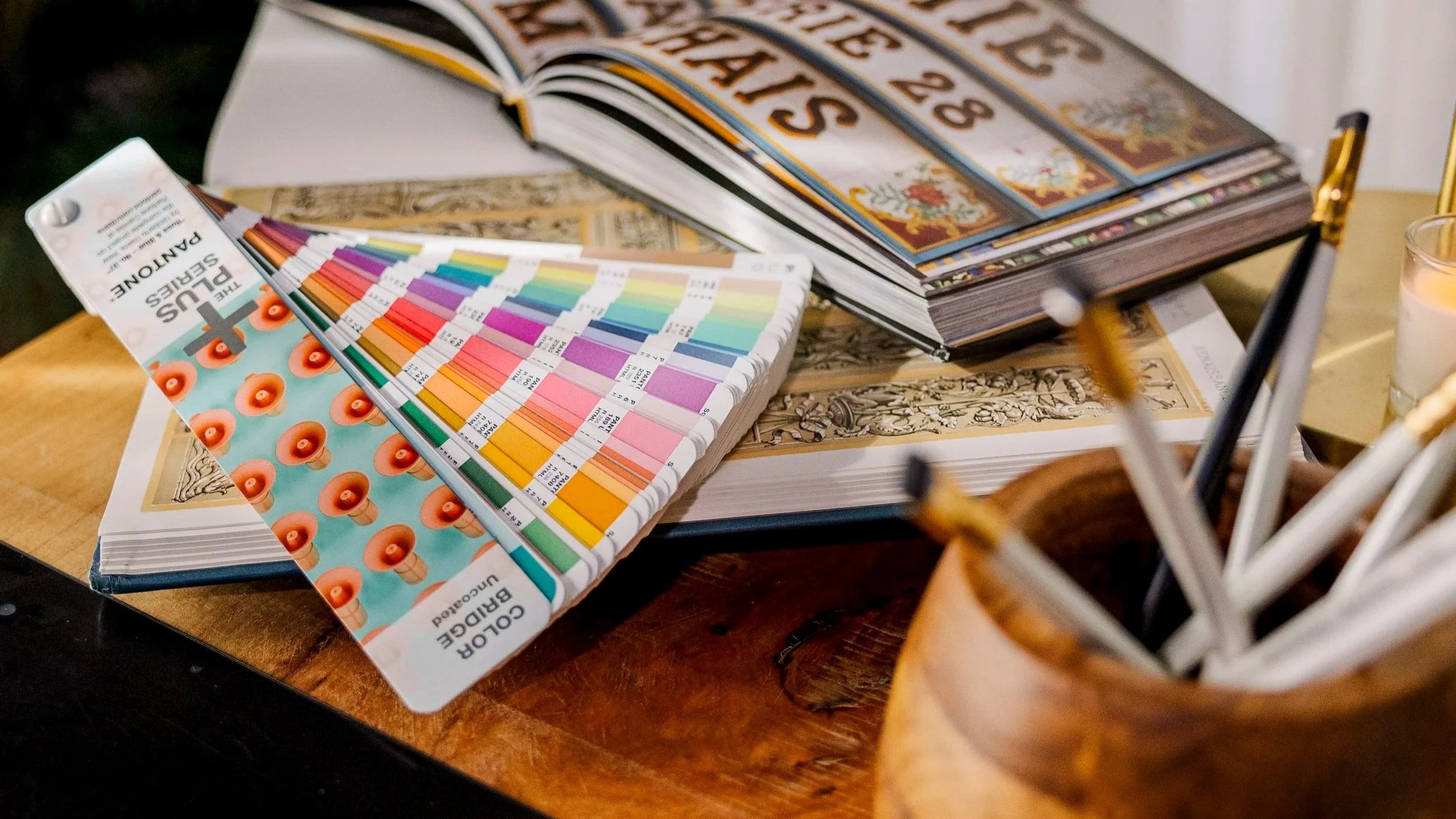
Choosing a Color Palette
Keep things simple here – I recommend 4-6 colors as a starting palette. You’ll want a couple dark tones, a couple mid-tones, and a few brights or highlight colors. This ensures you can layer your colors on top of one another in interesting compositions while maintaining enough contrast for legibility.
Web tools like color contrast checkers are helpful when you need to keep web accessiblity in mind, and tools like Coolors are fun for exploring palette ideas.
You’ll generally want a balance of warm and cool tones as well, so your brand doesn’t feel overwhelmingly one or the other.
The Dark Art of Typography
Selecting good type is a little bit science, a little bit magic and intuition. While the magic side is hard to teach in a blog post, I’ll offer some general principles.
For a starter brand, I recommend selecting two complementary fonts, and no more than three. Start off by selecting one serif or slab serif font, and one sans serif.
Some tips for choosing fonts and pairing them:
Pair fonts with a similar “x-height”: the height of the letters in lowercase should be similar between your two fonts.
Pair fonts with a similar stroke contrast – i.e., how thick and thin and each stroke of the letters get. High contrast fonts are good for dramatic headlines, but not good for body copy.
Make sure your body copy font is highly legible, especially when reading long paragraphs.
It’s a good idea to choose fonts with extensive families: make sure there are Regular, Medium, Bold, and Extrabold options (etc.), as well as a full italic set. Trust me, you’ll end up wanting all those options.
Explore cool font pairings with a tool like https://www.fontpair.co/all
Next, create a type hierarchy and stick to it. Designate one as your headline font (for BIG BOLD messages), and one for long-form body copy, and one for a medium, subheading size.
Pro tip: Stay away from handwriting fonts, unless you’re using one very sparingly for small splashes and highlights here and there. There are a lot of bad handwriting fonts out there, and finding good, legible ones can be tricky.
If your budget is truly $0, then free Google fonts are a great resource, and there are many good options to pick from. (The counterpoint to keep in mind is you run the risk of looking the same as every other biz using freebie fonts from Google).
A great typeface is like a great outfit, designer handbag, or pair of shoes – always worth the investment and prioritizing quality from the outset. You’ll live with these fonts a long time, so make sure to buy what you want upfront.
Sticking to the above principles will get you a long way. It’s not always easy, but investing time and energy in a great brand (and being consistent with it) pays dividends. Which of these are you most excited to implement?
Bookmark this guide for quick reference, and best of luck as you build your brand toolkit!

If this all feels overwhelming and you’d rather higher a pro to create your magical brand, send me an owl and your Fairy Brandmother will magically appear in your inbox to learn all about your business goals and brand dreams.