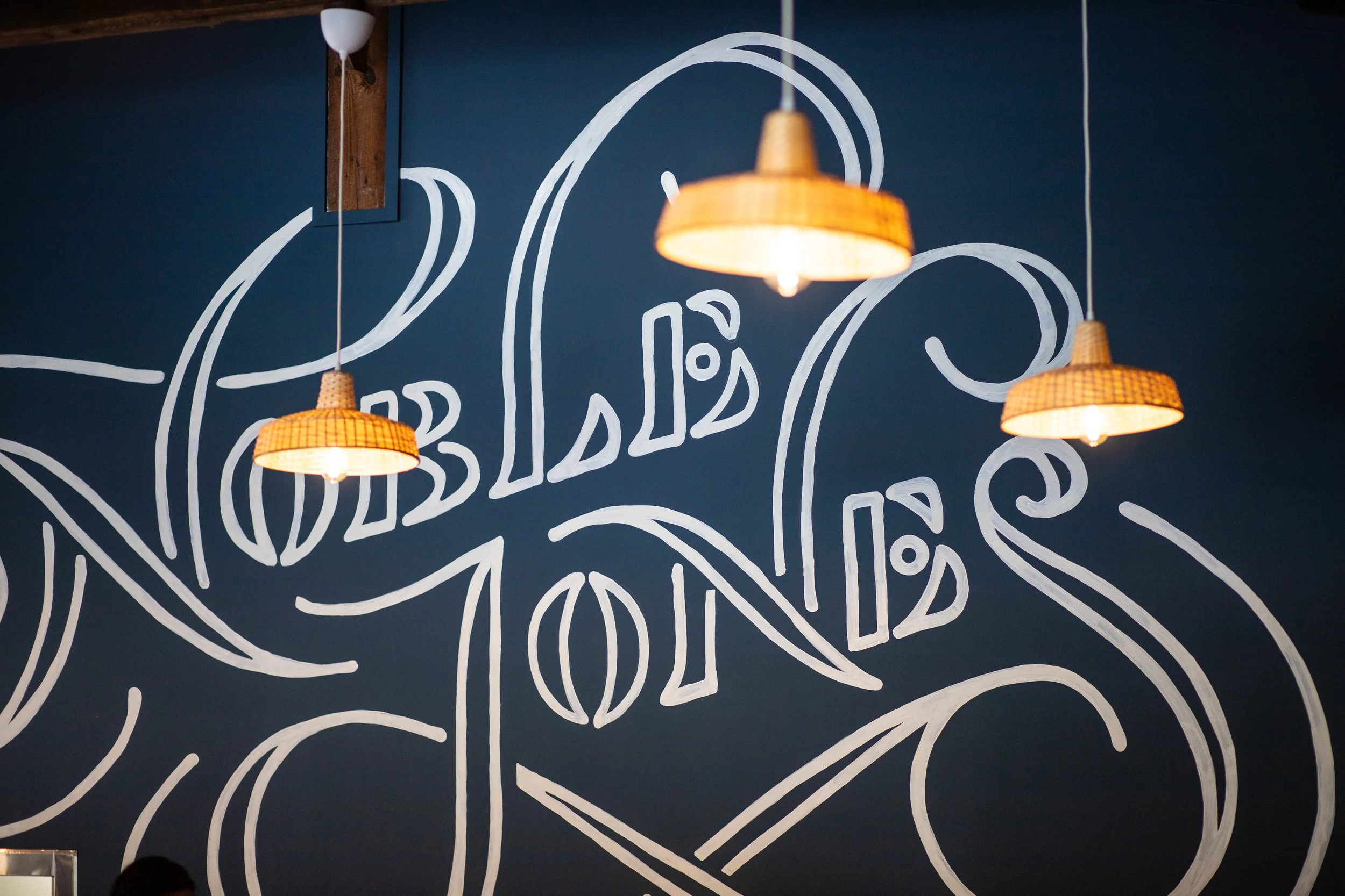
Noble Jones
Inner Radiance
Done for Wier/Stewart
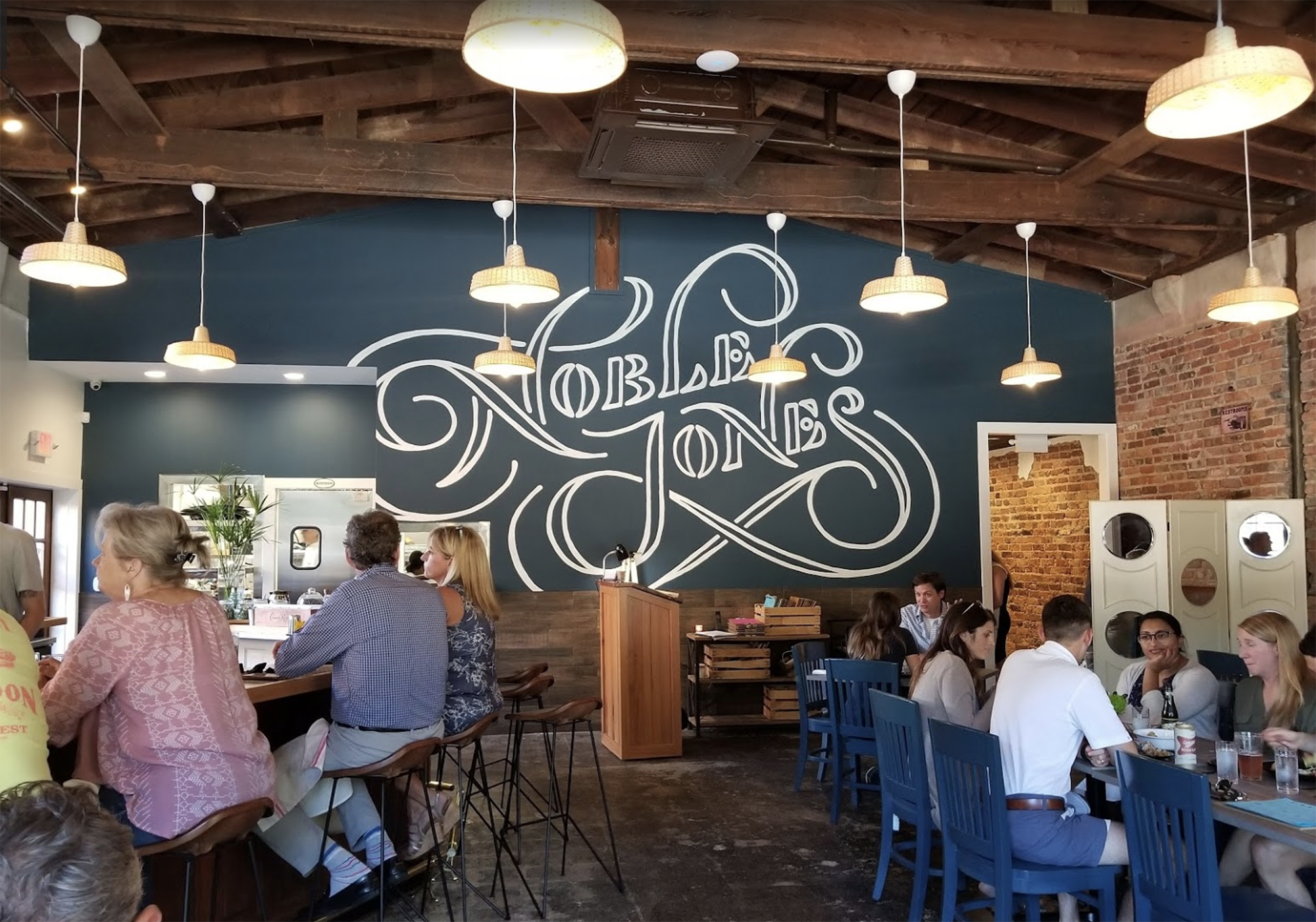
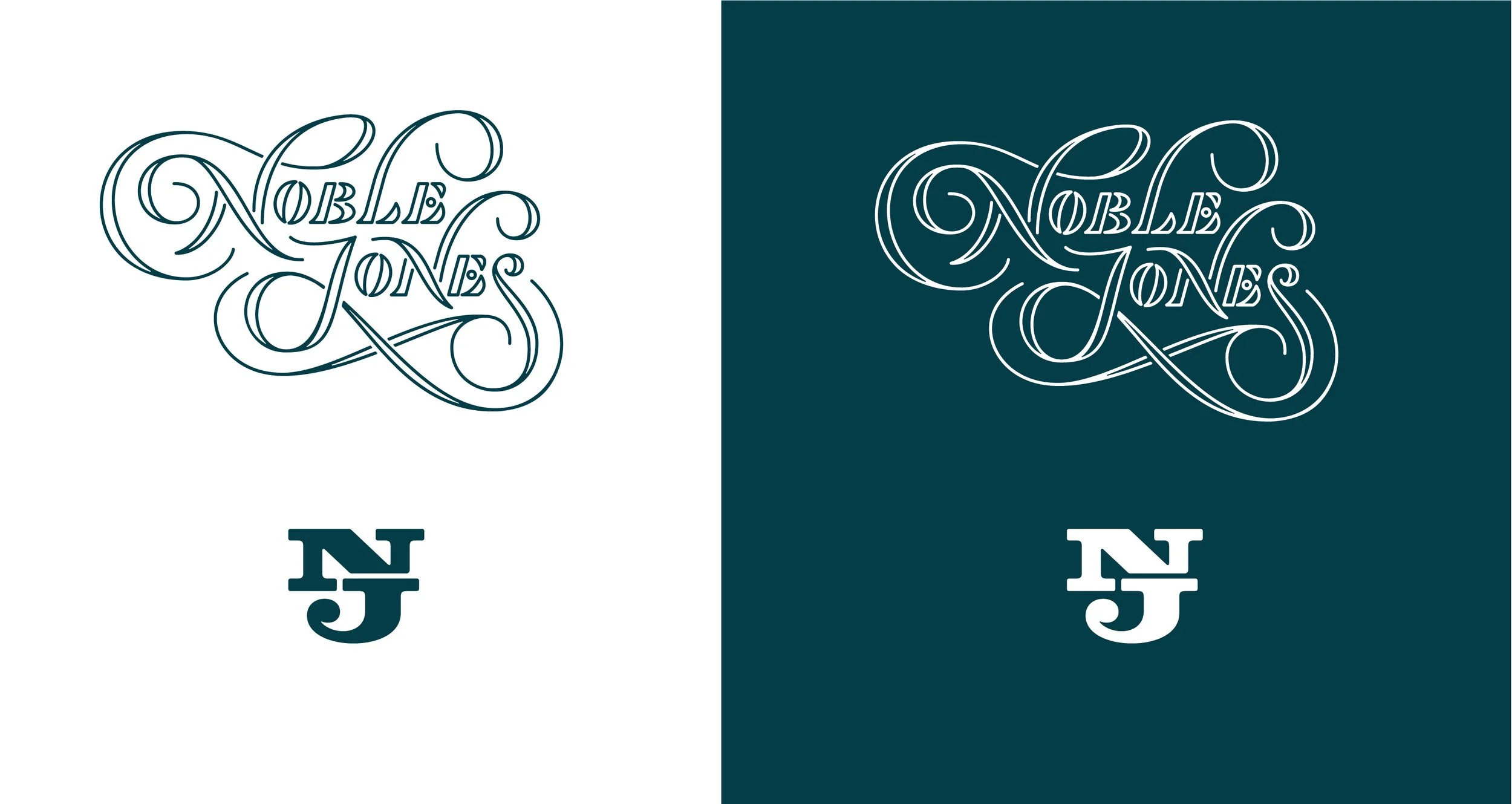
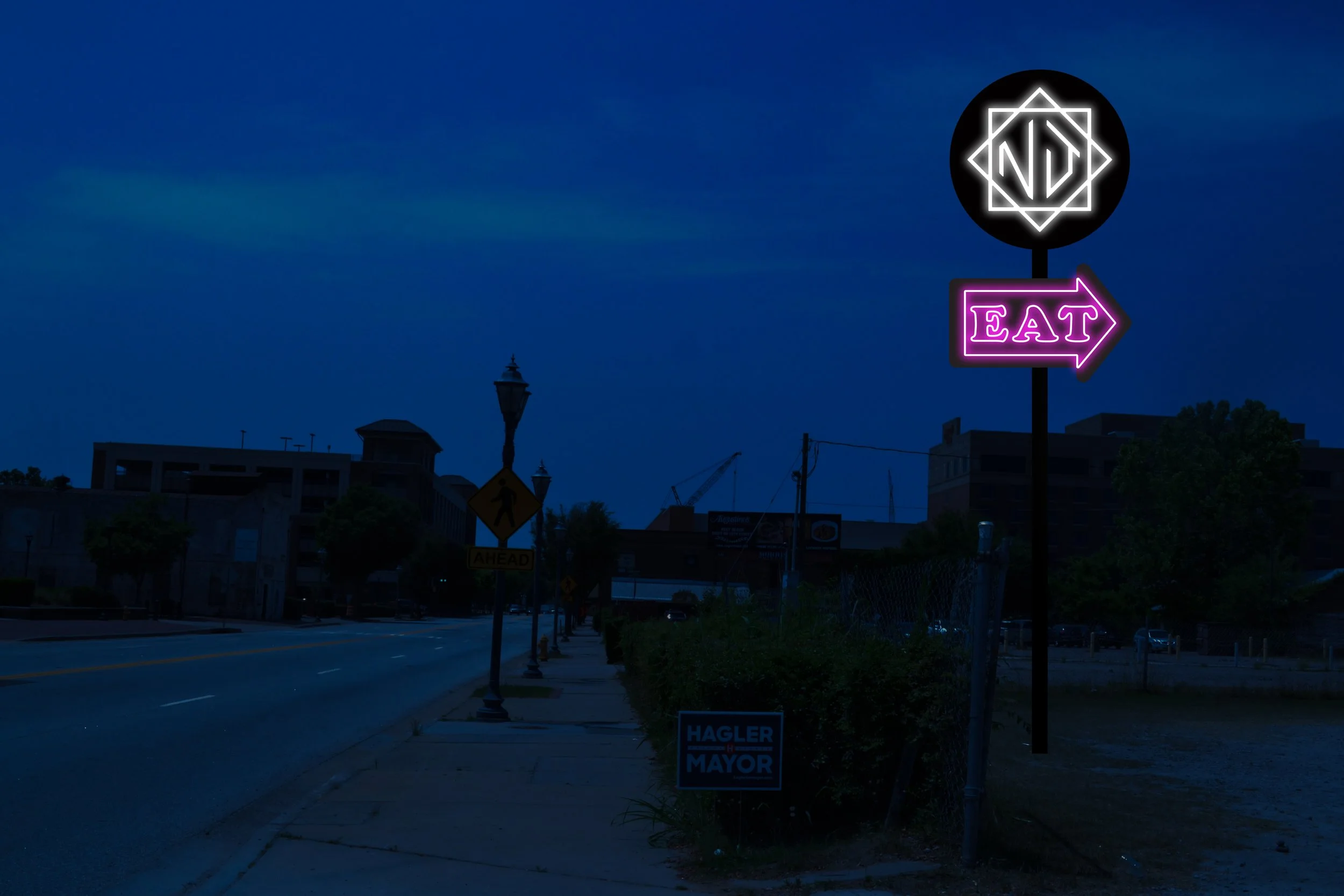
Beloved, singular, downtown Augusta, Georgia restaurant Noble Jones has been pushing the boundaries of Southern cuisine since 2018. With an innovative spirit rooted in tradition (chef JD Wier is trained in French cooking, by way of Texas), the best logo approach was a combination of these two things.
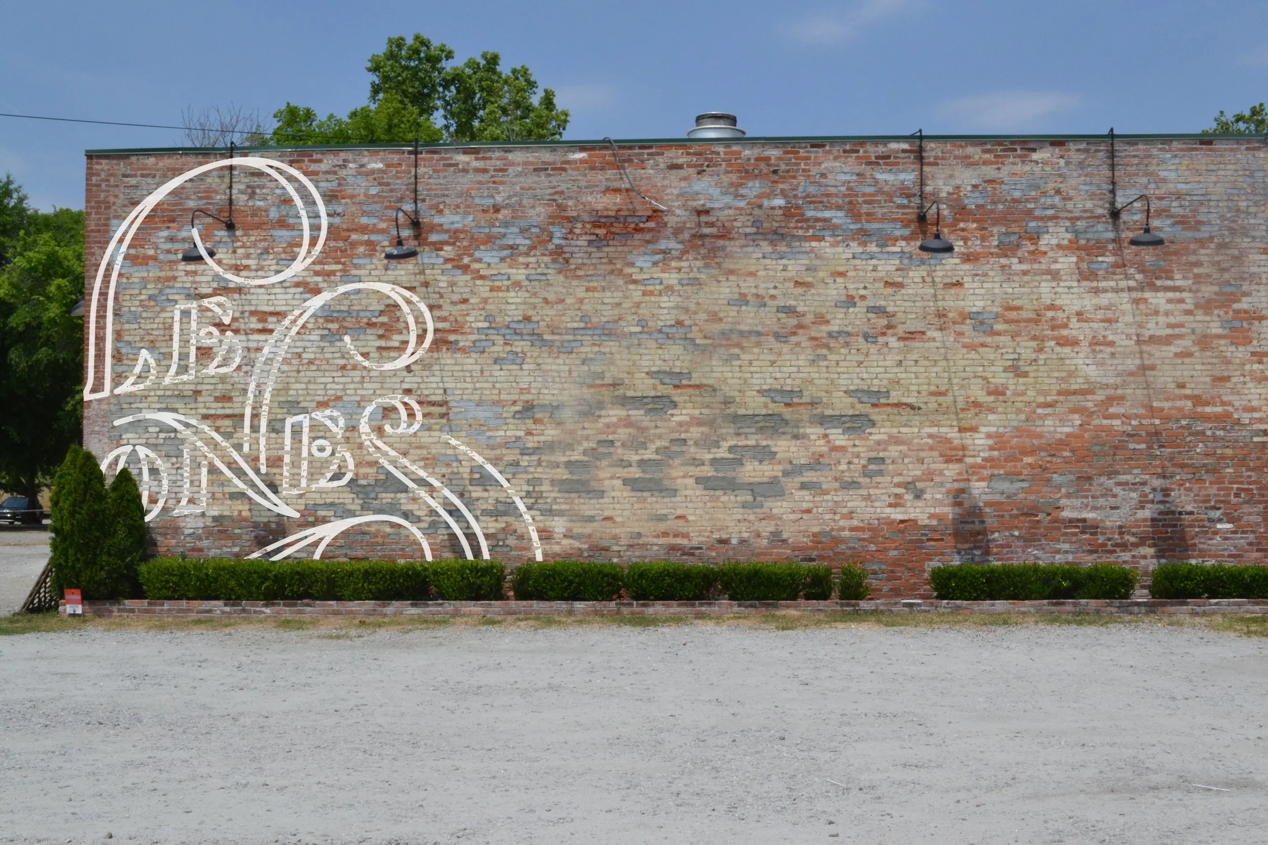
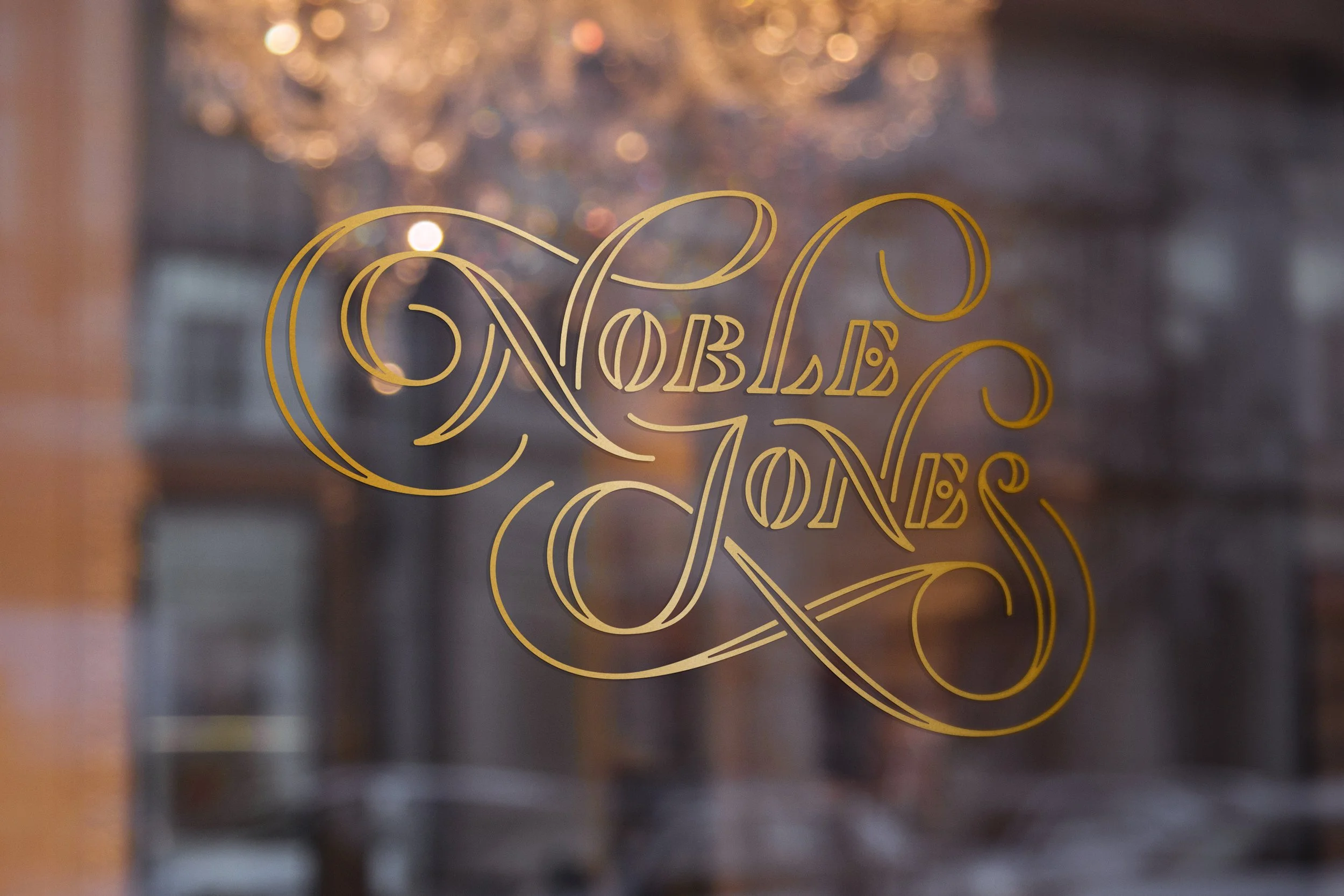
A classic + stable all-caps lettering style is subverted by emphasizing its outlines and adding lots of fun, extra swashes that encapsulate the wordmark, and give it balance. It works in several flavors - outlined, solid, layered.
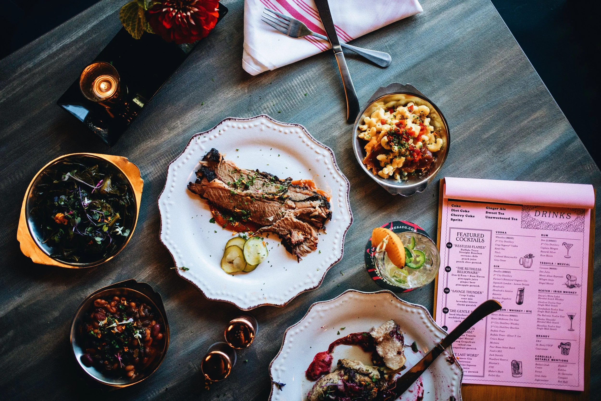
Classic navy is complemented by a surprising neon pink, and menus are printed on cheap, one-color pink copier paper to emphasize the accessible but exciting personality. Unexpectedly retro fonts evoke a tongue-in-cheek vibe, evoking the covers of the romance novels after which their cocktails are named.
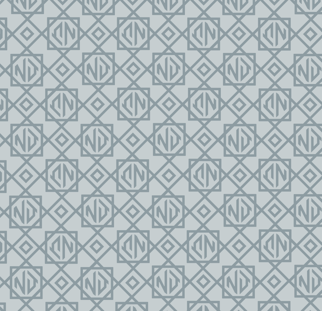
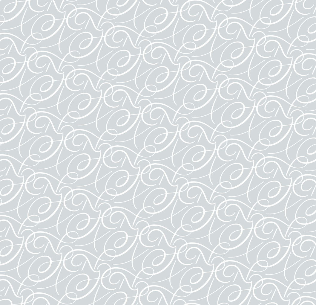
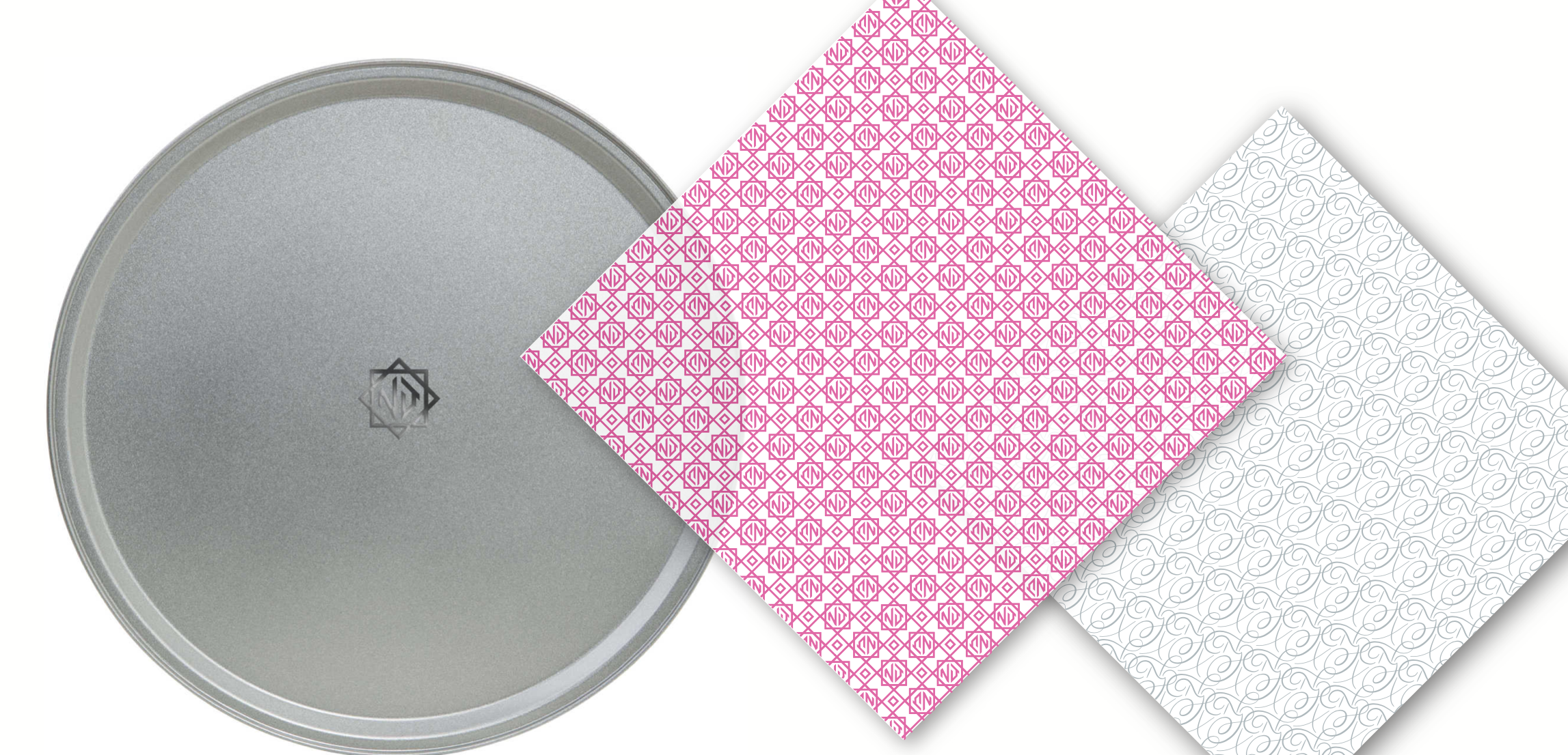
Two custom patterns are useful for everything from fancy interior wallpapers to tray liners for their infamous “Noble Style” tots + fries tossed in truffle oil. Yeehaw!
Southern-meets-unexpected
simultaneously high-brow / low-brow
consistently innovating in the culinary space
not self-serious / tongue-in-cheek
local, rooted vibes
historical and forward-looking
Brand Ethos


Brands infused with artistry and beauty far beyond ordinary.
If you’re looking for an inimitable, bespoke logo and compelling brand to match, consider me your Fairy Brandmother.
Spill the (magic) beans on your biz by clicking below 👇🏻 and we’ll get this party royal ball started.