
D’Eramo Creative
Based in South Carolina and working nationwide, D’Eramo Creative is a one-woman Marketing Agency (read: powerhouse) helping non-profits and small businesses connect with their audiences.
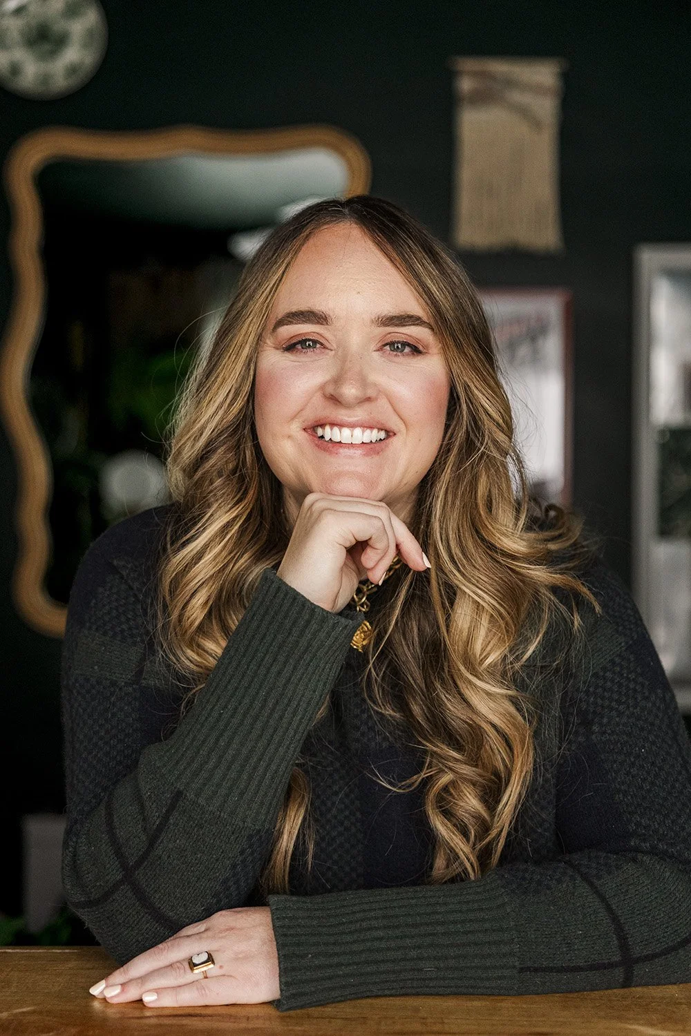
Owner Rachael D’Eramo reached out, with dreams of a powerful brand that would in turn help her biz reach her clients and communicate DC’s brand ethos in a way that felt aligned both personally and professionally.
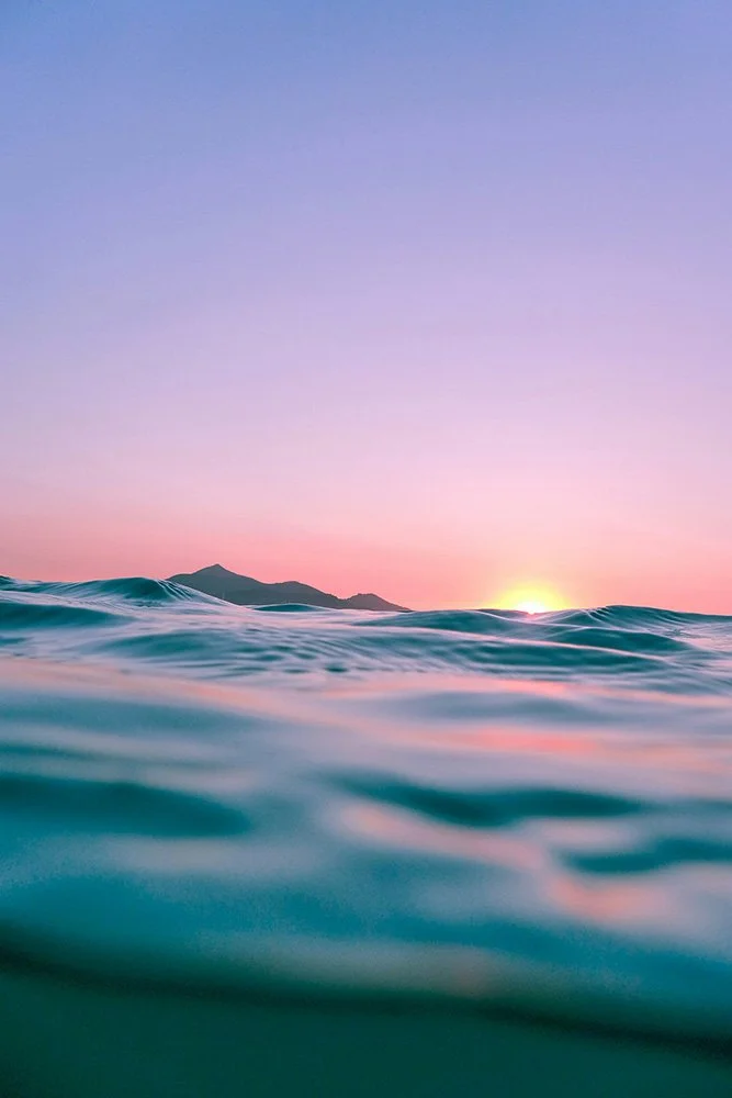
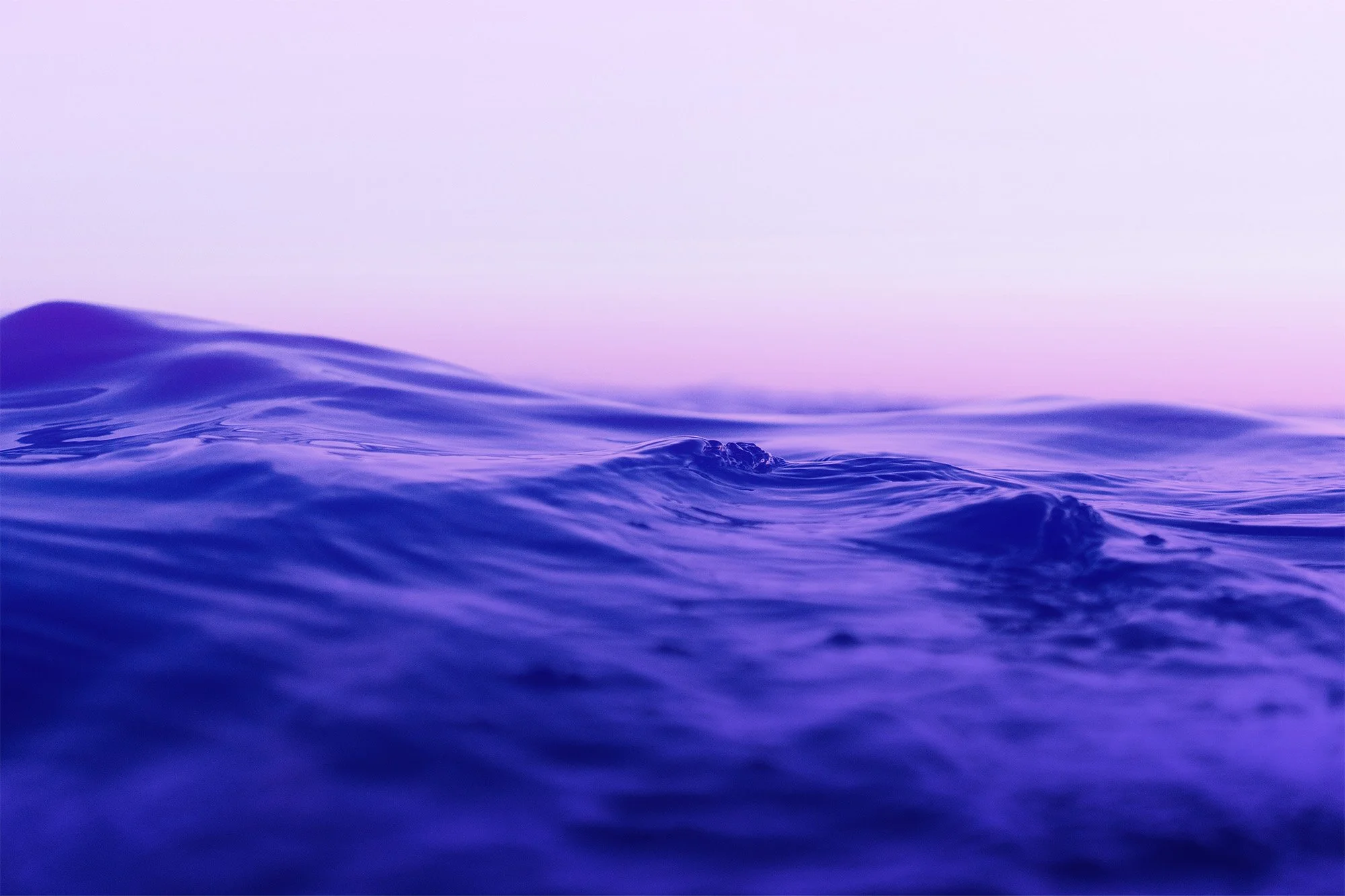
After a deep-dive brand workshop, we landed on a sea-inspired creative direction which would include a custom handlettered logo, brand icon, spot illustrations, watercolor textures, spirit marks, type styling and more.
Warm, kind and confident
Witty and creative
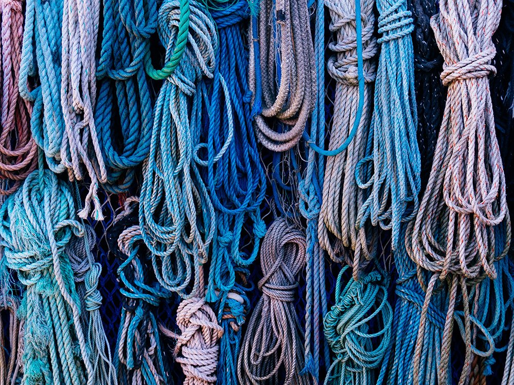
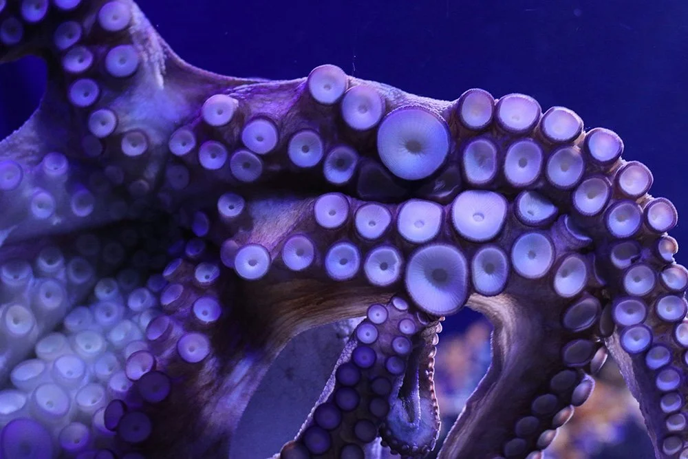
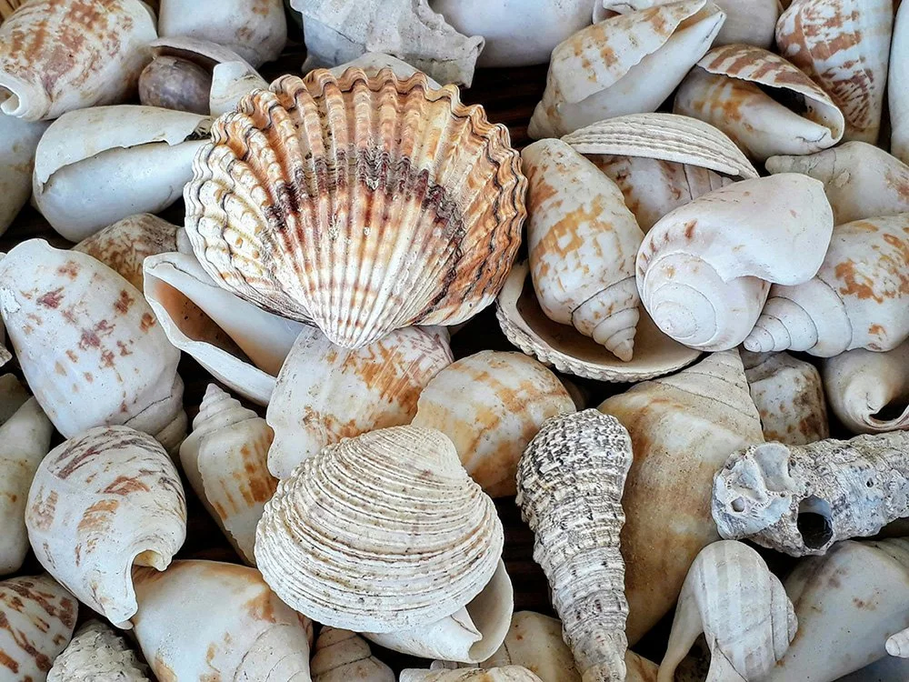
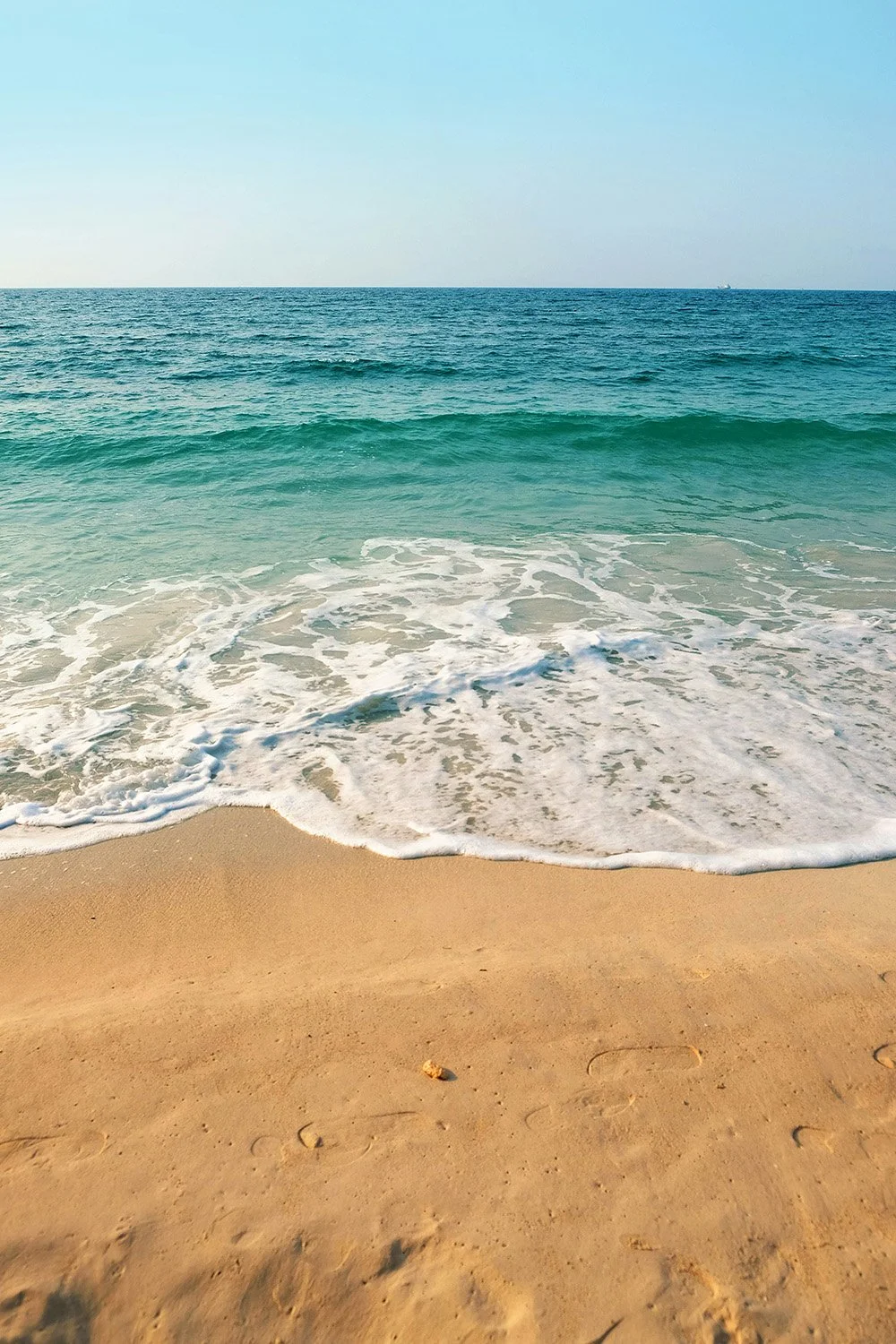
Sea life-inspired (a nod to Rachael’s Florida origins)
Whimsical, inspiring laughter
Professional, but not too ‘slick’
Bright colors paired with lots of white space
Feminine, not frilly
Textures - handdrawn elements and watercolors
Brand Ethos

sea-word
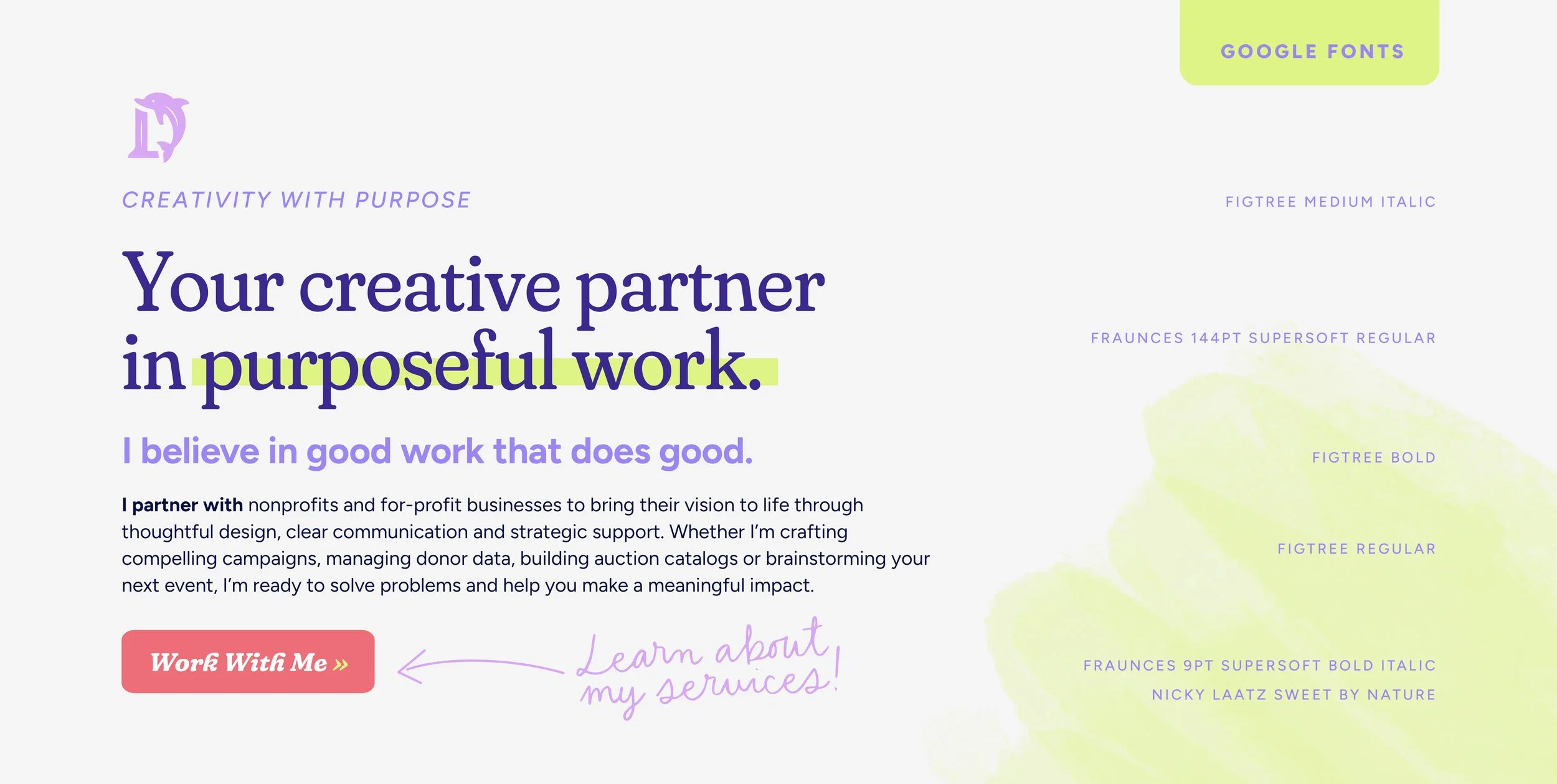
The primary logo for D’Eramo Creative is handlettered for max personality and legibility. Inspired by a dolphin’s tail (peep the easter egg in the ‘M’), the letters are customized with unique serifs that are a subtle nod to fins.
fintastic letters
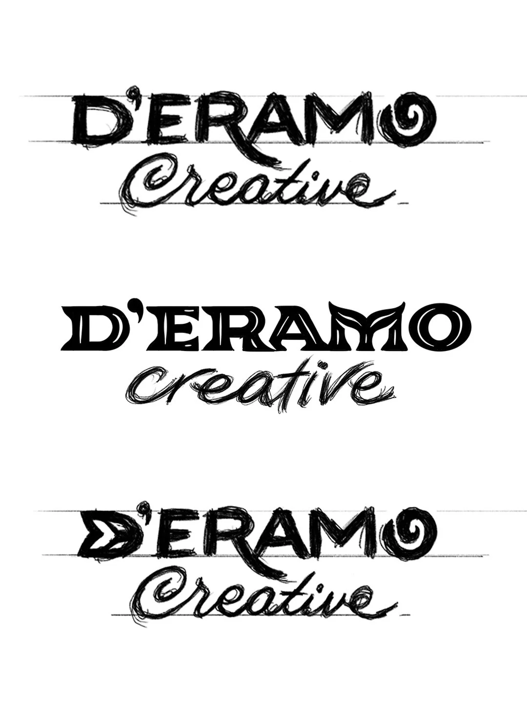
The DC wordmark began as a series of sketches, refined through several rounds to achieve the right balance of whimsical and professional. The dolphin tail ‘M’ needed to be subtle enough to blend with the rest of the letters, but not completely missed.
Digital sketching is iterative, which allows a lot of variations to be explored quickly, to discover the best possible solution. I was able to pursue several sea-themed lettering ideas that ultimately didn’t make the cut.

The ‘eureka’ solution was hiding a dolphin tail within the M, and customizing the serifs on each letter to coordinate. The key to making this work was ensuring the M still blended well with the rest of the letters.


“Through true collaboration, Rachel brought my brand to life in a way that feels deeply personal and completely aligned with who I am – both professionally and personally.”
Rachael D'Eramo / Owner, D'Eramo Creative
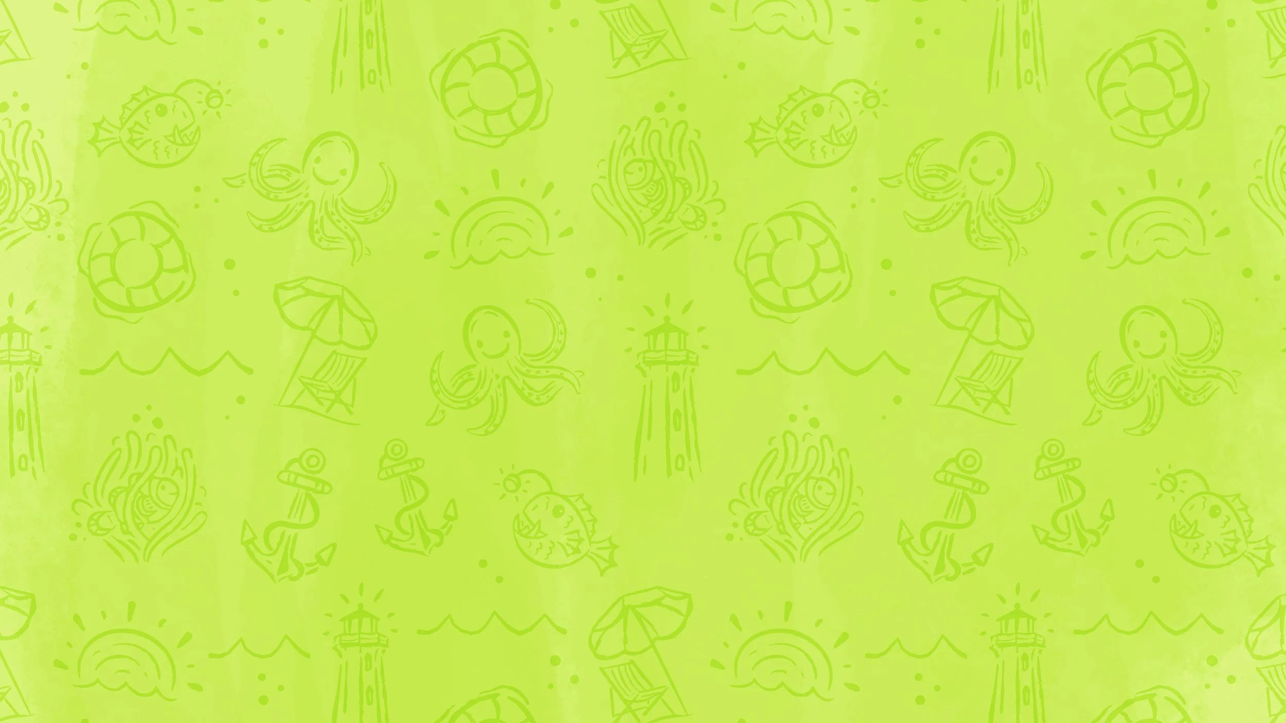
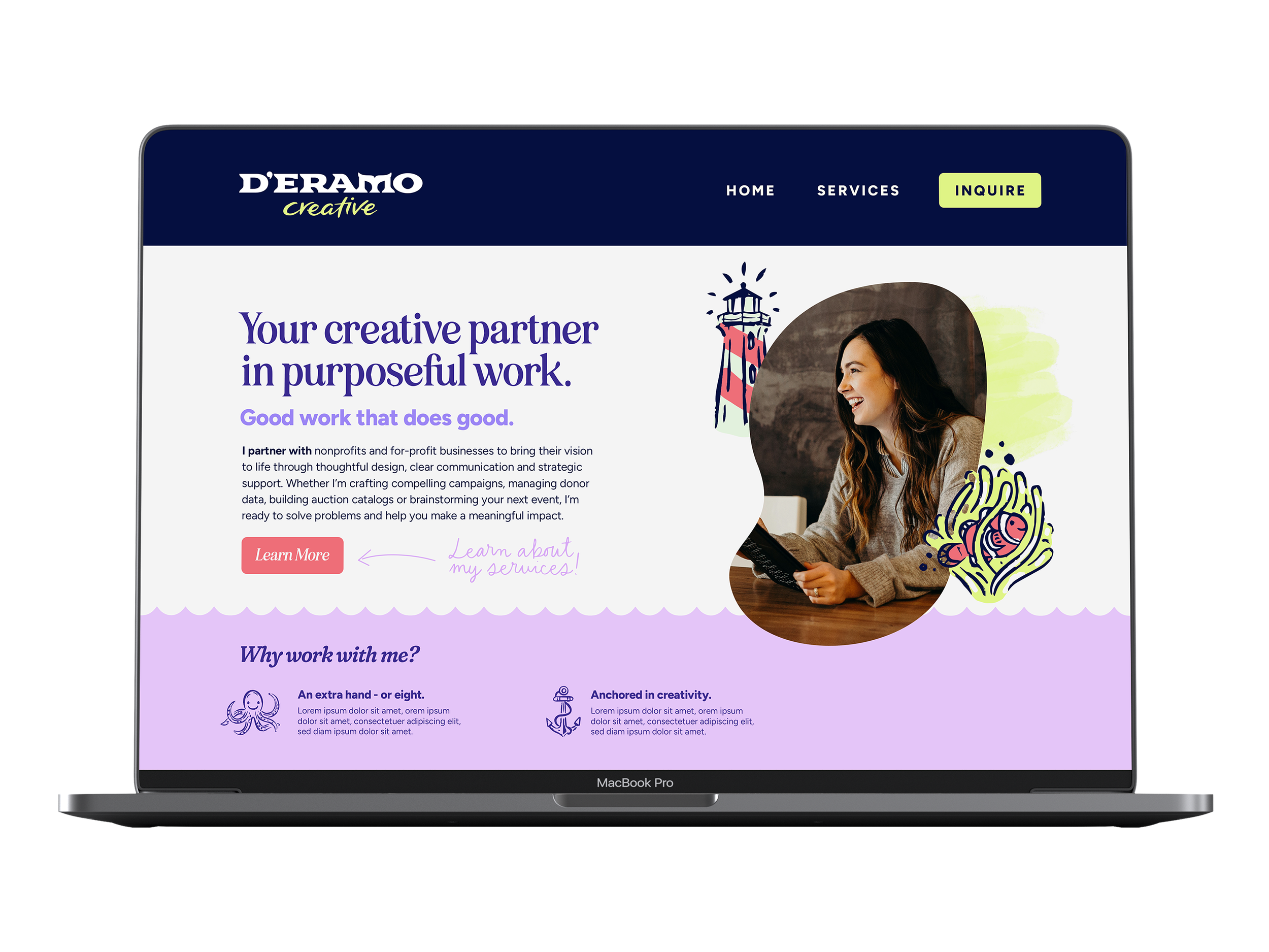
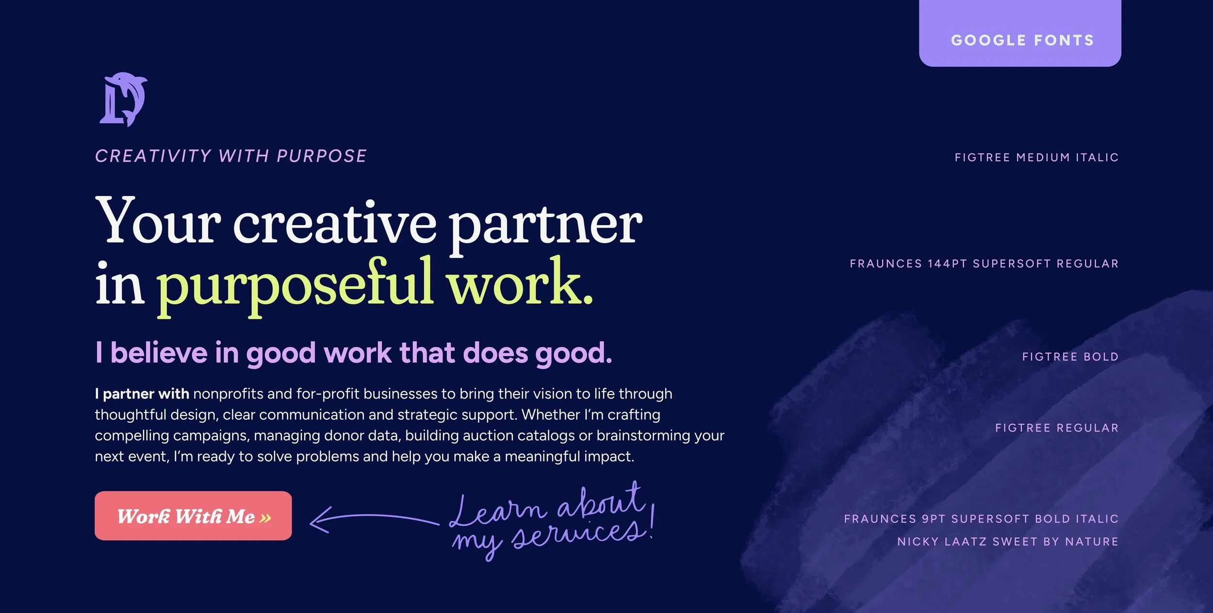
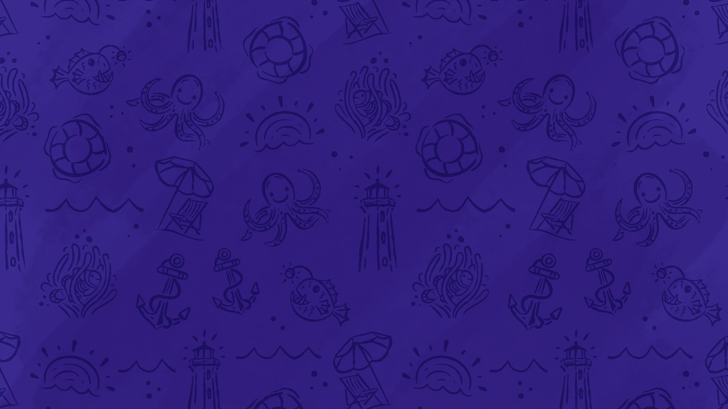
Because D’Eramo Creative is primarily marketed online, it was important to bring in textures and hand-drawn elements that helped the brand feel warm and human.
Ample use of whitespace helps temper the bright color palette, and allowing everything to breathe and feel easy to read and navigate.
digital deep-dive
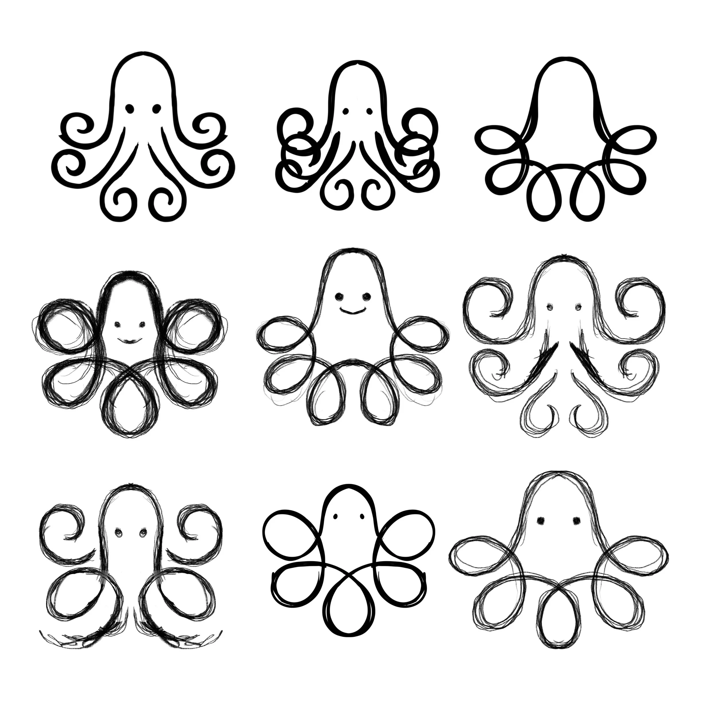
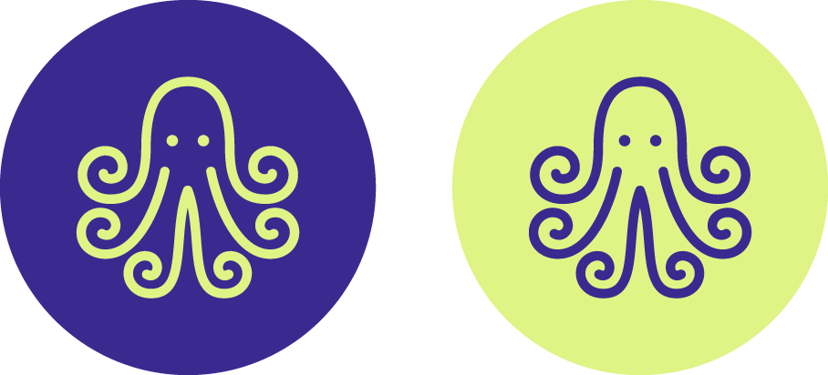
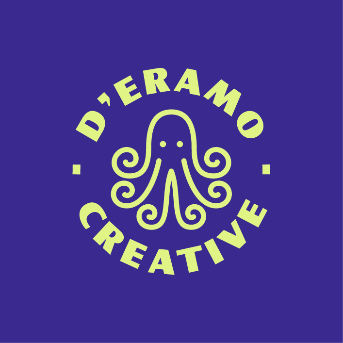
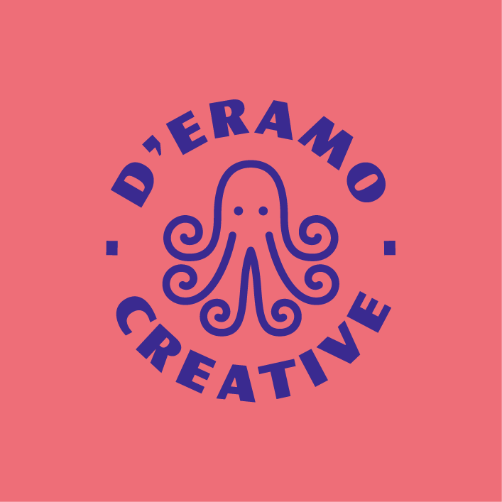
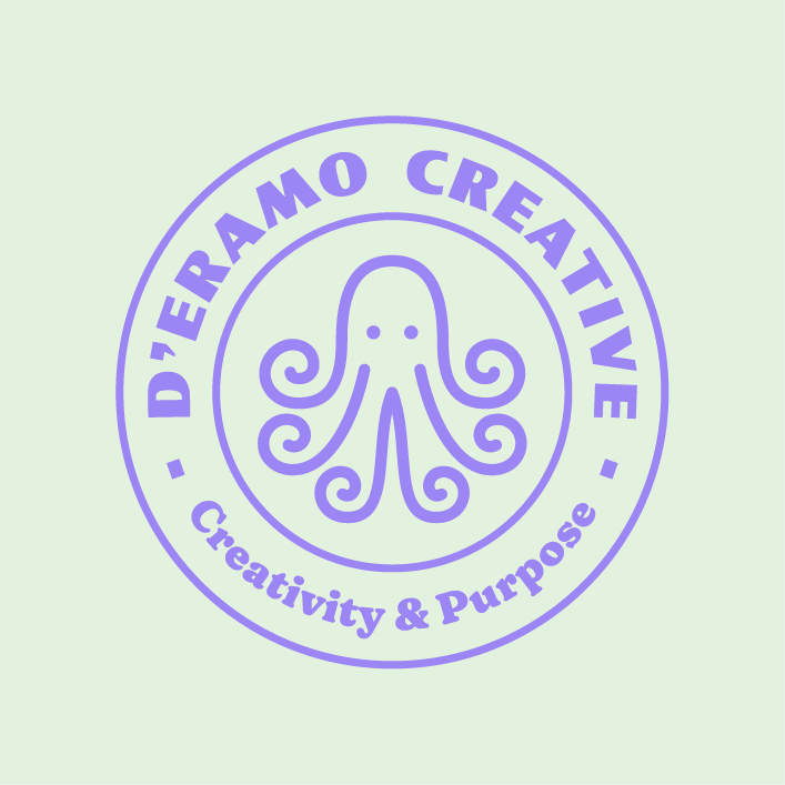
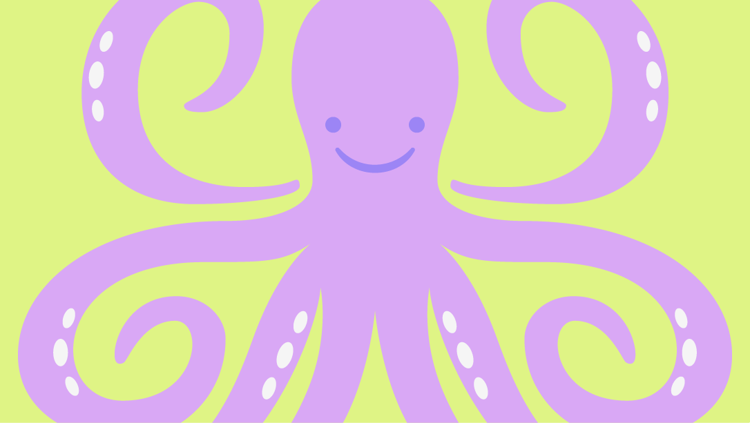
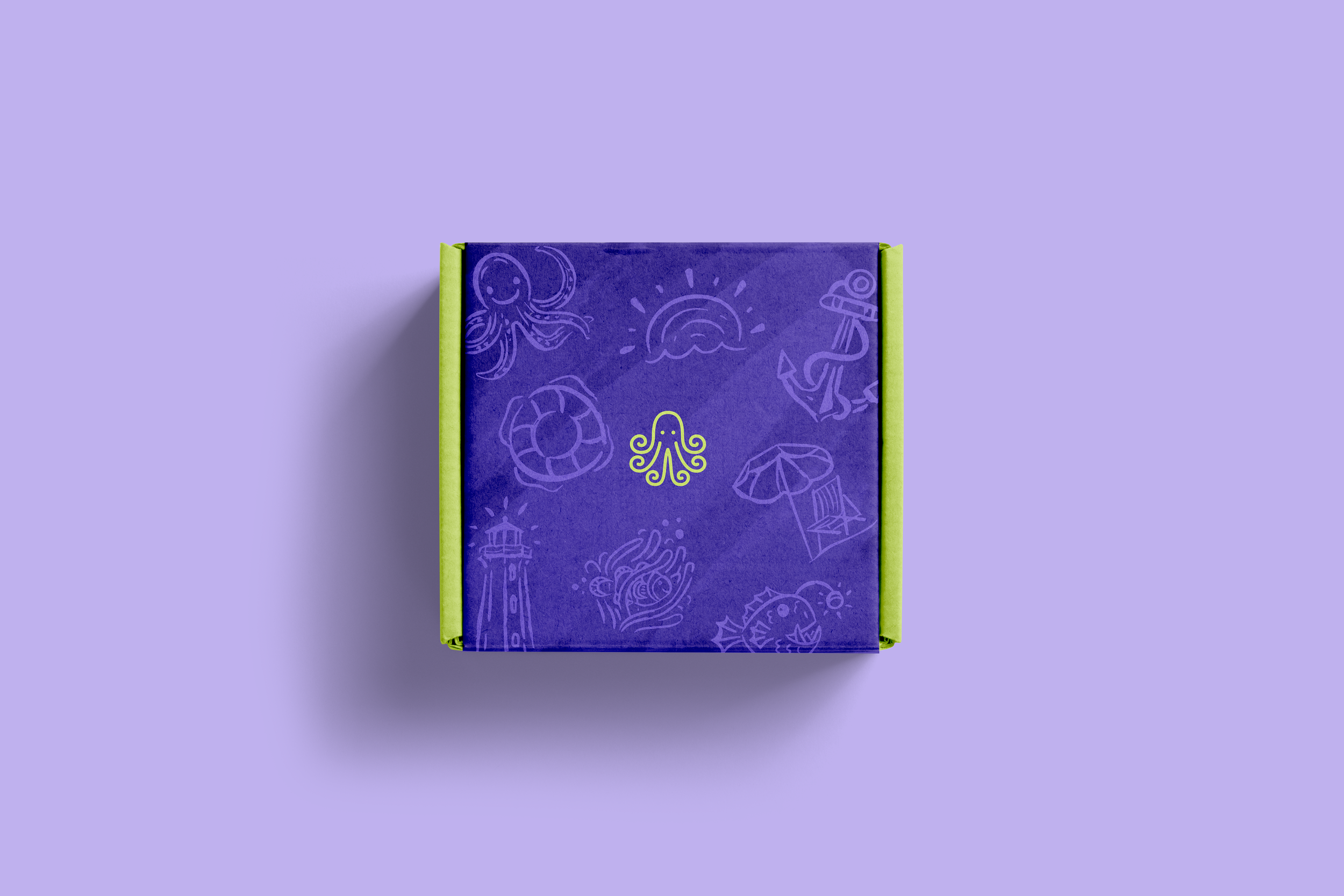
Within the universe of this sea-inspired brand, the octopus arose as the best embodiment of D’Eramo Creative’s brand story.
Rachael approaches each project like an octopus; multi-armed – taking on a variety of tasks simultaneously and with grace, alleviating the marketing burden from her clients.
She is always reaching in every direction to bring in strategy, creativity and detail-oriented execution to her projects.
And our humble octo icon, with his six arms, also reflects the six core values of DC: creativity, clarity, communication, connection, consistency, and collaboration.
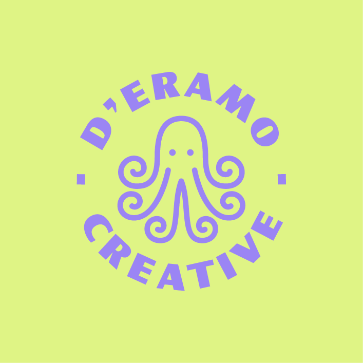
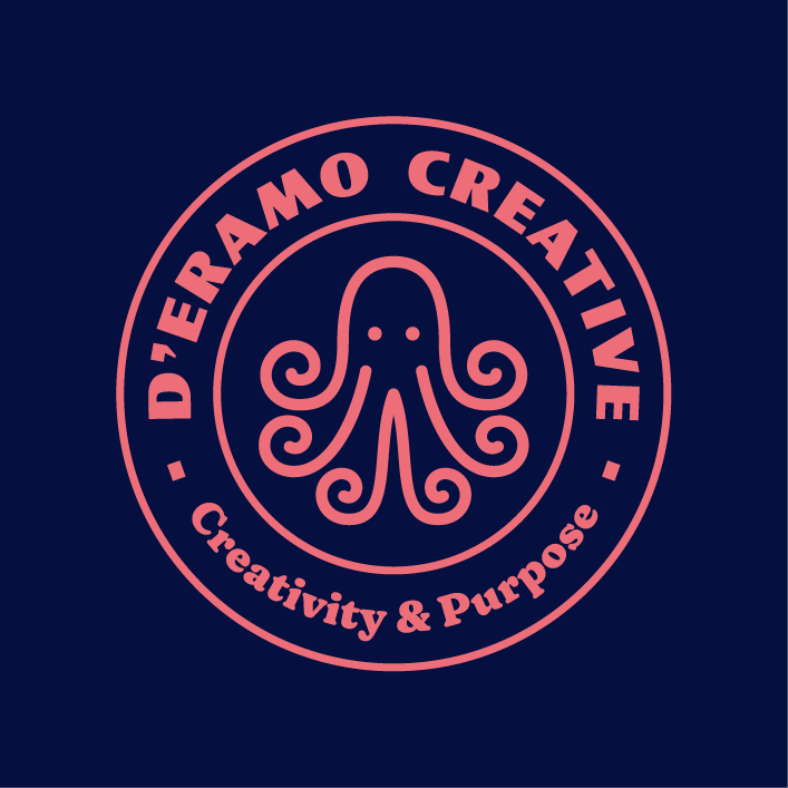
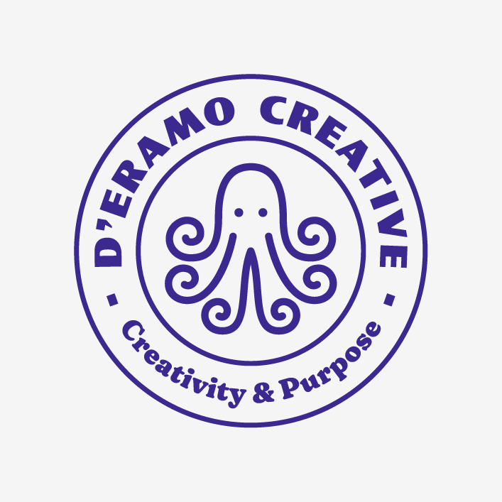
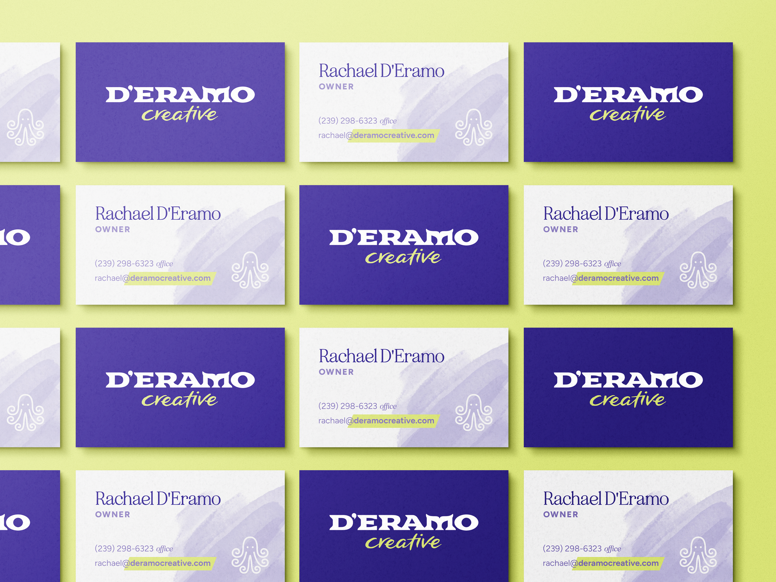
The Octo-con

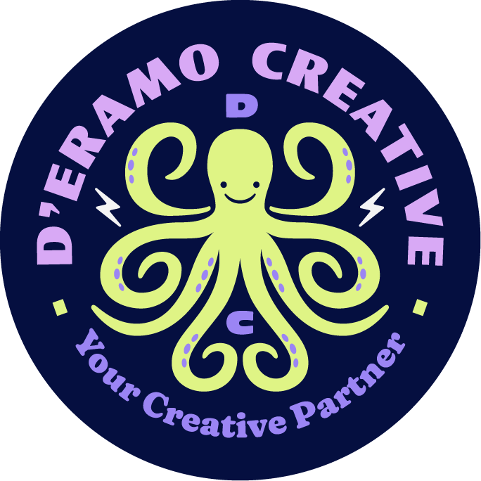
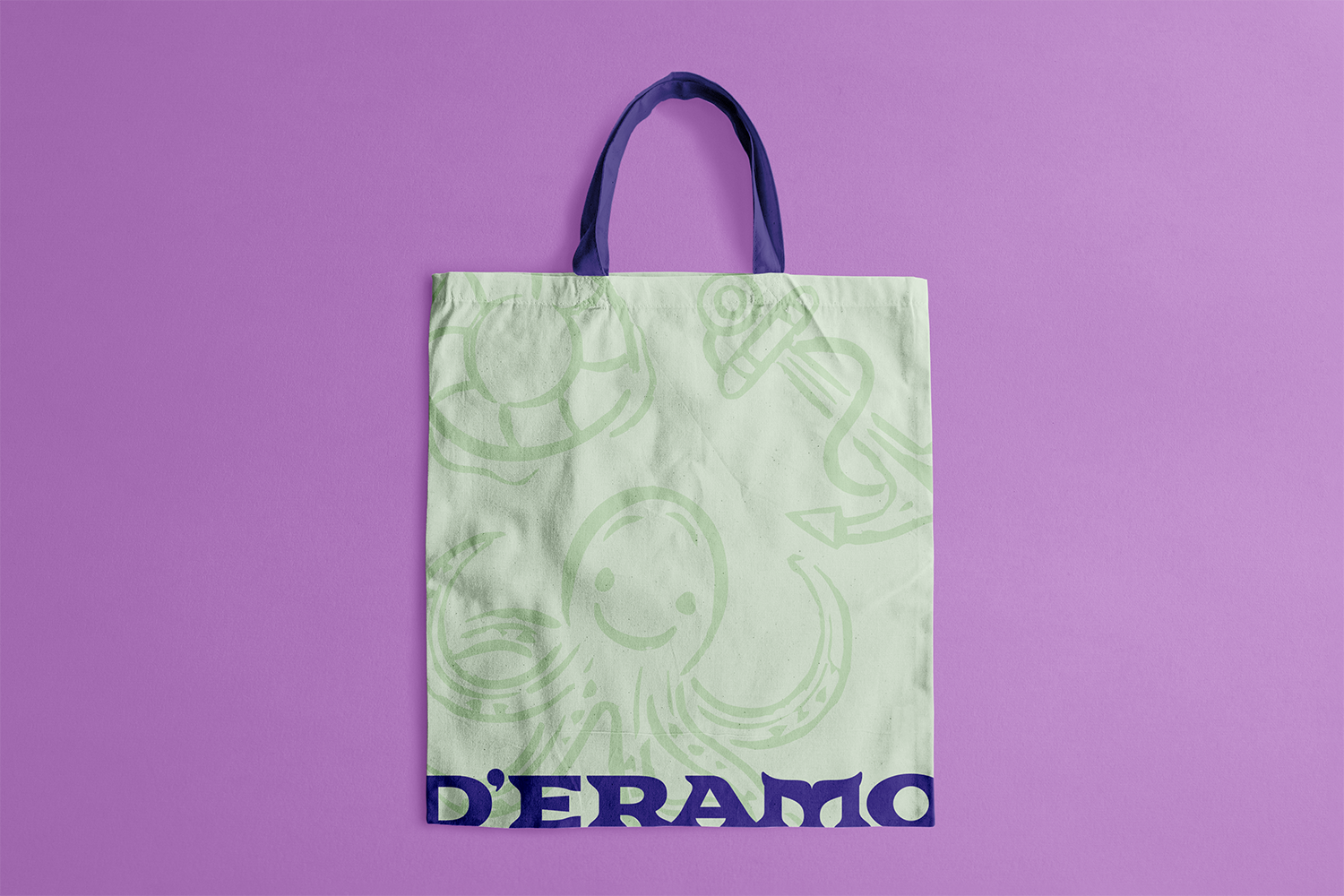
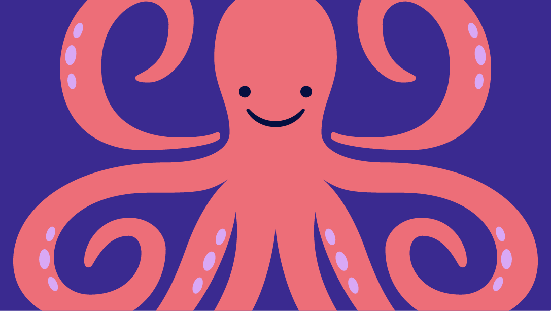
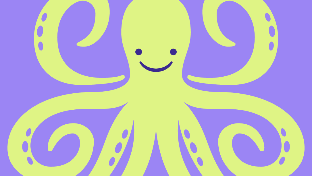
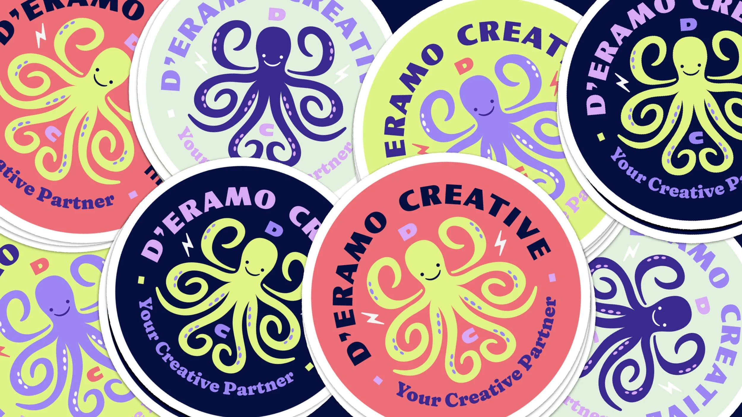
We created a set of spirit marks and extra badges for D’Eramo Creative, a whimsical and useful way to express the brand without overusing the primary logo.
We designed a secondary, more illustrative octopus that text could be wrapped around, ideal for stickers, patches, tees, packaging and social graphics.
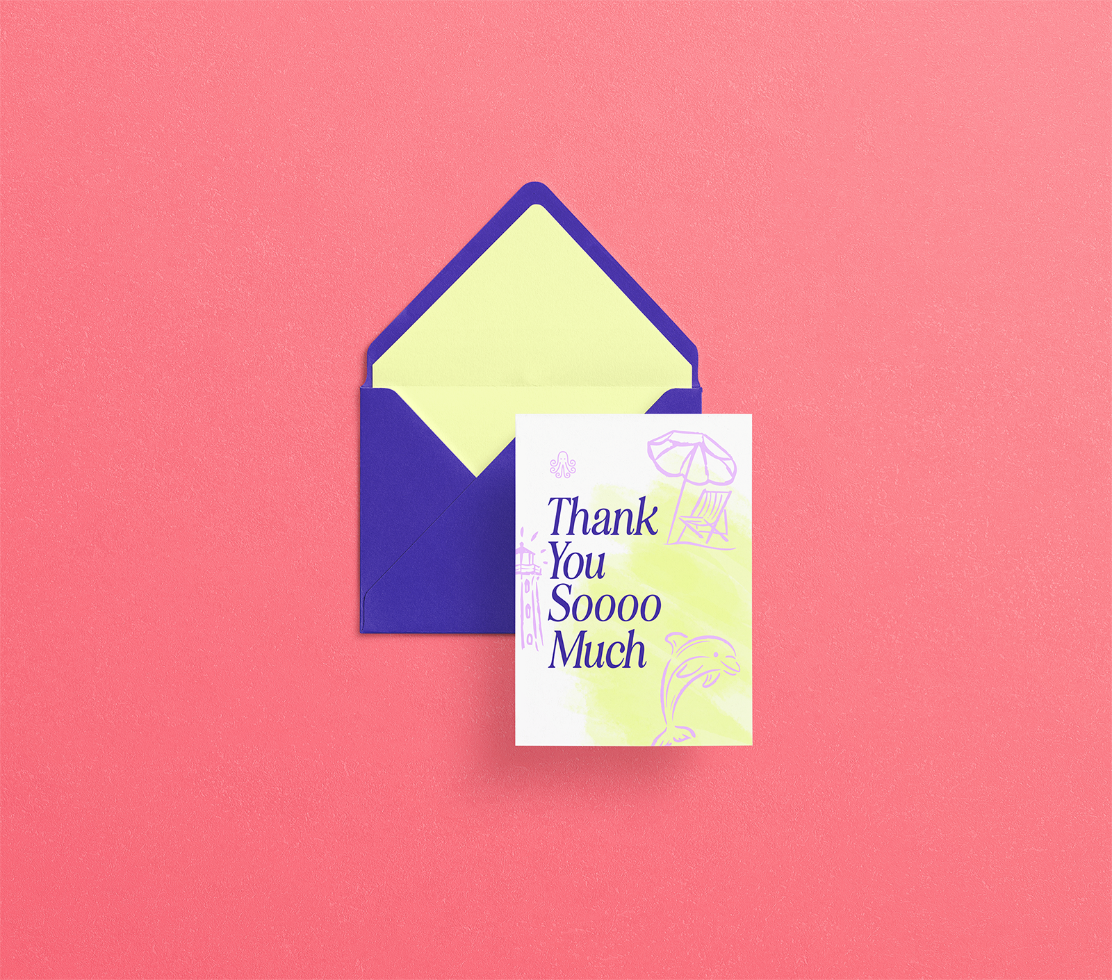
Rachael loves sending her clients gifts through the mail, so having a secondary set of illustrations and marks is ideal for creating fun customer touchpoints and swag.
star of the sea
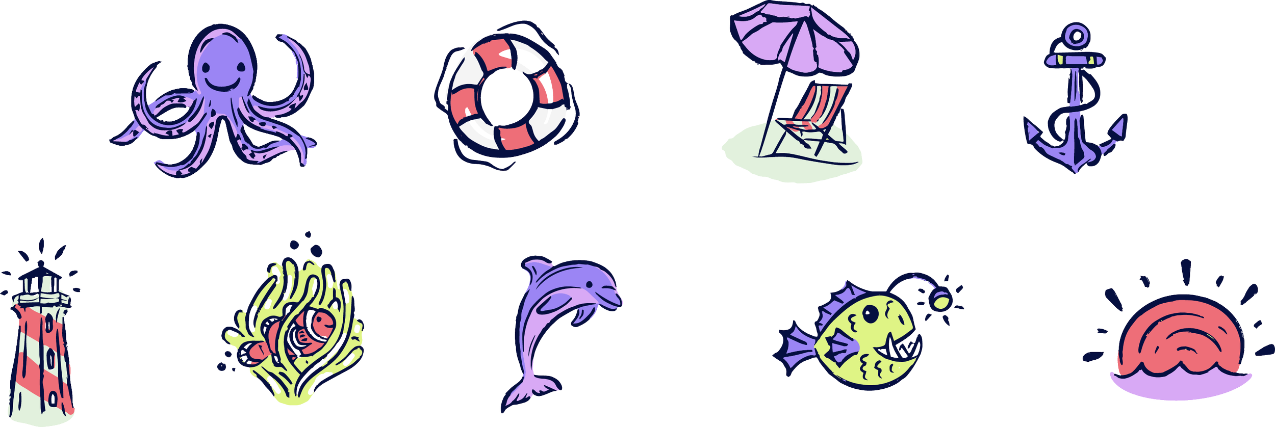
To complement the cleaner graphics and to bring in a friendly, human hand, we created a set of hand-drawn illustrations, each with a meaning that ties back to the way Rachael serves her clients. They can be used full or single-color, and become a piece’s focal point or splashed in the background for overall effect.
beach brigade

Colorful personality
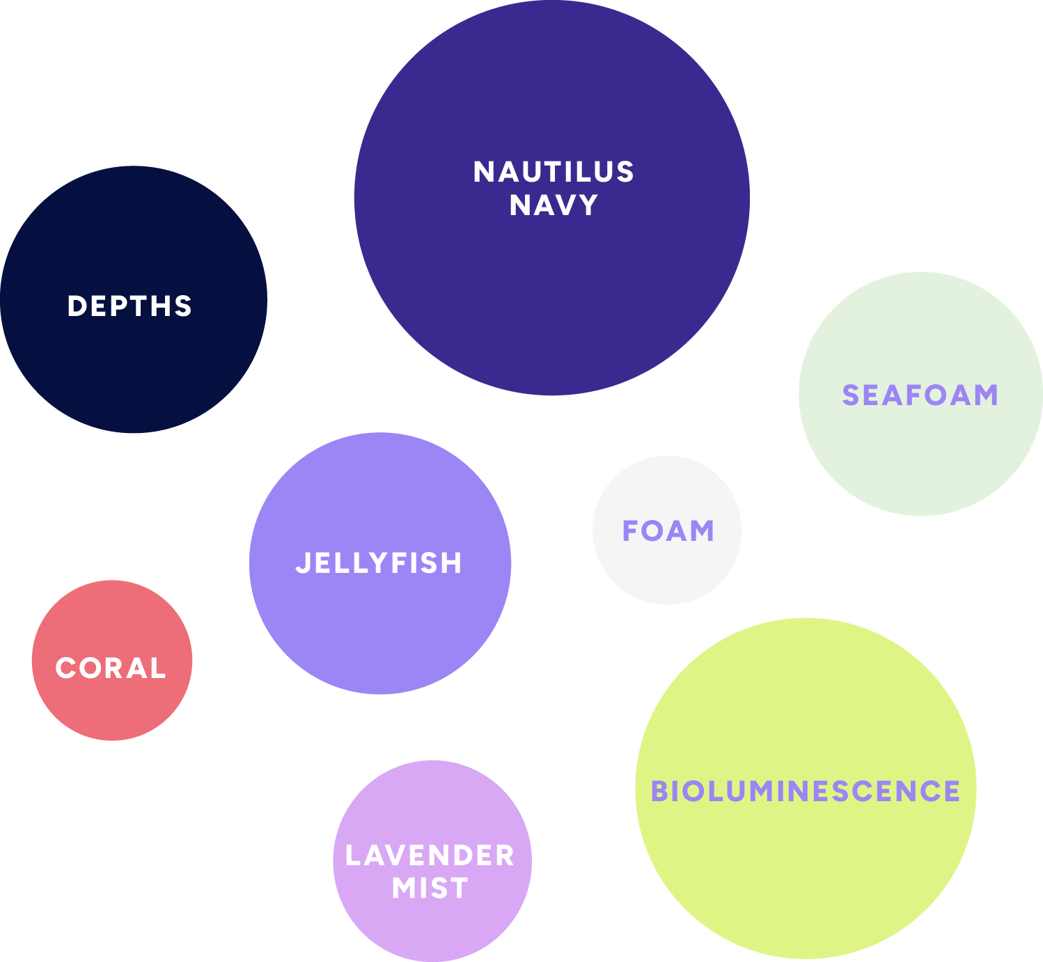
Rachael brought a strong sense of color to the project, excited about vibrant colors that reflect her brand’s confidence, creativity, and optimism.
We landed on a sea-inspired palette of dark, mid, bright and pastel tones which ensure the palette can be layered and paired in varied and creative ways.
We worked to create a strong type palette to unify D’Eramo Creative’s messaging across all her marketing channels.
The fonts help create a friendly, approachable, and authoritative tone of voice for Rachael’s brand messaging.
Type Styling
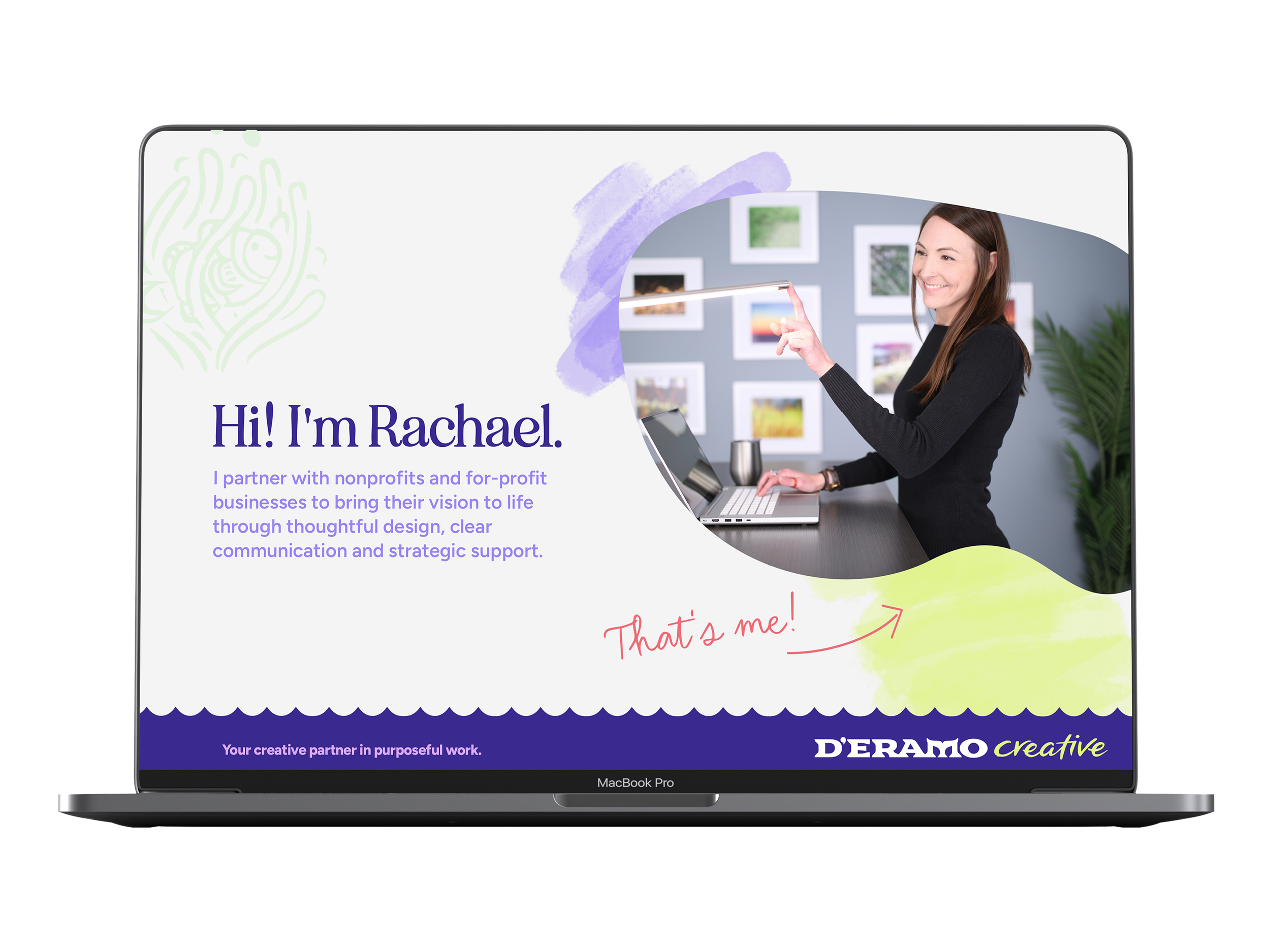
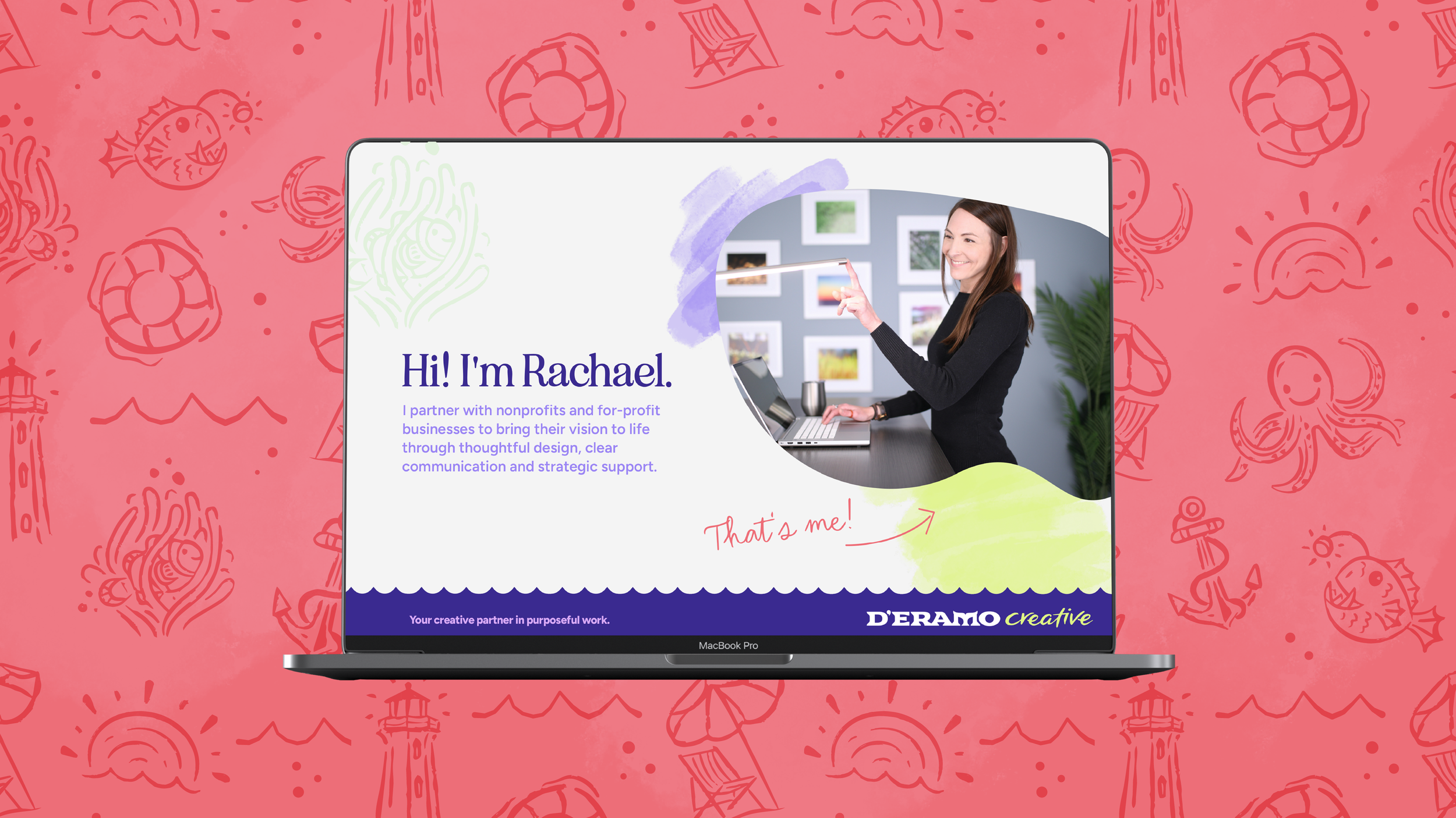
We imagined what Rachael’s pitch decks to clients might look like in the new brand – complete with custom watercolor textures, wave borders, and photo containers inspired by nautical shells and shapes.
pitch & yaw
“The octopus symbolism perfectly reflects my nonprofit background and work ethic. I’m thrilled with my brand for D'Eramo Creative and look forward to working with Rachel again.”
Rachael D'Eramo / Owner, D'Eramo Creative
Let’s work together. If you’re looking for a stellar brand, or have a design project in mind, spill the (magic) beans by clicking below 👇🏻 and tell me all about it.